
Neutral, Not Flat: Layering Depth for Refined Rooms
Today we’re exploring curating a neutral palette with depth for refined rooms, turning quiet colors into a sophisticated conversation of undertones, textures, and light. Expect actionable pairings, tested paint combinations, tactile strategies, and small decisions that compound into calm richness. We will examine how off-whites, complex beiges, mushroom grays, and soft charcoals build character without shouting, and how wood tones, metals, and stone add resonance. Share your go-to neutrals in the comments and subscribe for weekly, real-world examples and checklists you can apply immediately.

When Restraint Becomes Richness
Minimal color does not mean minimal interest; it demands precision. By calibrating undertones, contrast ratios, and surface profiles, restrained rooms feel layered, not sparse. We’ll map the difference between sterile beige and nuanced neutrals that hold attention, using designer case studies, controlled experiments with daylight, and practical rules that keep serenity intact while personality grows.
Contrast can be whisper-soft and still legible. Pair a warm greige with a cooler limestone fireplace, then add a low-sheen walnut for grounding. The trick is proportion: larger surfaces calm, smaller accents sharpen. Our palette math shows how much separation eyes need to register contour without visual noise.
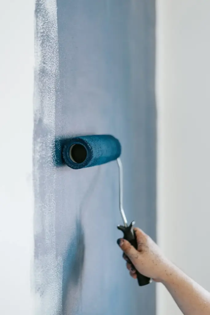
Every neutral carries a hidden color bias. Test samples against pure white and natural wood to reveal green, purple, pink, or yellow shifts. Harmonize by repeating one undertone three times across paint, textiles, and stone, allowing light temperatures to drift gently without causing jarring mood swings.

Undertones: The Invisible Architecture
Undertones shape how materials converse under changing light. A taupe that sings at noon may turn muddy at dusk if its red core clashes with cool LEDs. We’ll break down warm-cool relationships, metamerism pitfalls, and sample-testing rituals that prevent costly repainting and help textures feel intentionally orchestrated.
Light, Shadow, and Sheen
Depth depends on how surfaces bend light. Gloss bounces, matte absorbs, and eggshell negotiates. By mapping daylight arcs and tuning bulb temperatures, you can create silhouettes that read sculptural. We’ll show how to mix finishes without patchiness, and how shadow lines become elegant boundaries rather than gloomy corners.
Finish choreography
Use matte on broad walls to soften glare, satin on trim to outline architecture, and semi-gloss sparingly where you want light to skim. The result is a subtle rhythm: soft fields, crisp edges, and occasional sparkle that guides the eye without feeling theatrical or cold.
Daylight mapping ritual
Trace the sun’s path for a week. Photograph corners at set times, then note glare, dead zones, and warm pools. Adjust window treatments, lamp heights, and reflective surfaces so mornings feel clear, afternoons cocooned, and evenings quietly luminous, with no single hotspot fatiguing attention.

Texture, Pattern, and Restraint
Neutral spaces crave touchable variation. Coarse linen beside smooth leather, knotted wool near cool stone, and micro-patterns that barely read from afar create depth you feel before you see. We’ll layer tactility with discipline so the room whispers invitation rather than shouting for attention.
The three-texture rule
Anchor with one dominant texture that sets mood—chunky weave, velvety nap, or polished plaster. Add a secondary texture that contrasts in scale, then a third that bridges them. Stop there. Over-layering blurs intent; selective variety keeps curiosity alive and maintenance realistic for busy households.
Patterns that vanish, then appear
Tone-on-tone herringbone, minimal pinstripes, and faint geometrics add pulse without shaking serenity. Choose patterns whose contrast is close to the base color, so details emerge only at proximity. Guests discover them slowly, rewarding attention and extending visual interest long after the first impression fades.
Natural materials that age gracefully
Oiled oak, unlacquered brass, tumbled marble, and clay-based paint patinate with dignity. Small marks become stories, enriching neutrals with honest history. Choose finishes you are willing to maintain, and embrace variation; perfection feels brittle, while gentle change amplifies depth without a single new color introduced.
Curating fewer, bigger gestures
A large monochrome artwork, oversized branch cutting, or hefty ceramic grounds the room and clarifies intention. Big pieces allow neutrals to frame, not compete. Measure sightlines from doorways and seating positions to ensure proportions feel generous, not imposing, and invite lingering glances rather than quick scans.
Breathing room as a luxury
Leave margins on shelves, gaps around sofas, and a clean stretch of wall to absorb light. Negative space functions like rest in music, letting textures and lines resonate. Resist the urge to fill; trust the palette to supply quiet confidence and easeful circulation.
Longevity, Care, and Seasonal Refresh
A neutral palette with depth pays you back over time. Durable fabrics, maintainable finishes, and thoughtful storage preserve the calm you worked to build. We’ll plan cleaning routines, rotating accents, and quick seasonal edits that keep rooms evolving gently instead of requiring dramatic overhauls.

All Rights Reserved.